
The three circles are both symbolic of the three owls and stars on the coat of arms, but also a representation of the cotton industry through the machines that made Leeds thrive. The blue colouration reflects the colour of the river Aire that bends through the city and has been key to the city’s development to what it is today. The typography has a balance of corporate identity and an approachable nature. The L’s are visually interesting and the gap between them represents the canal within Leeds as well as the journey that the museum will take it’s customers on.
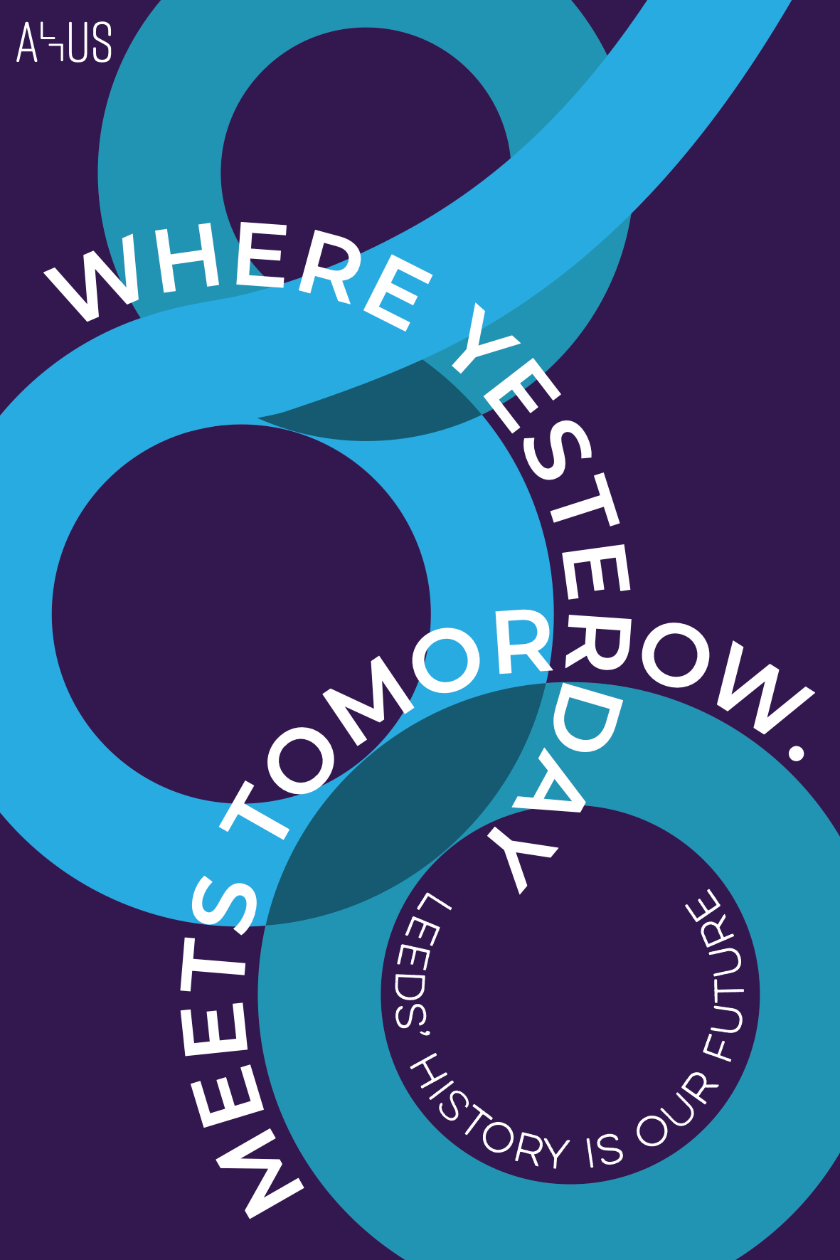
I believed that the idea and design of my logo would be a perfect background for my typographic poster as it looks aesthetically pleasing and has brand values behind it with strong meaning. I also wanted to match this with an equally strong phrase that makes the reader actively participate and understand the purpose of the museum. The type curves around the logo heightening interest for the viewer, and results with ‘yesterday’ visually meeting ‘tomorrow’ with them sharing a letter. I thought that the phrase was too abstract and so I reaffirmed the museum’s theme through the official tagline.
I had the clock accelerate over time showing the journey that the museum will take the viewer on. The date stops winding back at 1626 which is the date that Leeds was founded. This clear and effective message is designed using the iconic Town Hall clock, to make it instantly recognisable and personal. It then breaks and reveals the cogs that were spinning behind which represent the industrial heritage that Leeds was built upon and the importance of its waterways. The cogs then fade into the logo which conveys the interwoven connection that the museum has with Leeds.